Pageviews last month

Wednesday, September 29, 2010

Color Schemes with Linear Perspective


ART 102: Two-Dimensional Design

PROJECT #4: Color Schemes with Linear Perspective
Due Tuesday, October 12

Color Schemes (examples above)
1. Complimentary (across from each other) 2. Monochromatic (one hue with tints, tones and shades) 3. Analogous (next to each other on color wheel) 4. Neutral (mix compliments) and 5. Warm/Cool (use both in same composition)

Materials:
Five pieces of drawing paper each one: 7 x 9 inches
Sketchbook
Drawing pencils
Gouache paint, all colors
Watercolor brushes, round and flat, various sizes
Surface for mixing paint
Black mat board for final presentation (cut 1” border on all four sides for each of the five compositions. You will have five separate mounted compositions.
2-sides adhesive paper or UHU (acid free) glue stick (or both) for mounting or your choice what works!

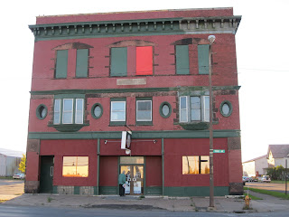
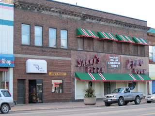
Objectives: To create five compositions that use five different colors schemes using the same drawing five times that is inspired by a contour drawing of your Superior Historical Society building. Go to the building take a photo to look at later and draw it in your sketchbook. Copy your drawing again for each color scheme. The color schemes are: monochromatic, analogous, complementary, neutral, and warm/cool. Please label each piece with your name, the name of the building and the color scheme.

Procedure:

Step #1: draw in your sketchbook three or more drawings of your building.

Resource for 2-Point Linear Perspective: http://www.youtube.com/watch?v=felys-u4nfk

Step #2: Choose one of the drawings and reproduce it 5 times on the drawing paper.


Step #3: use gouache paint to create five small compositions (each using the same drawing, so you draw it five times on 5 different pieces of paper), each a different color scheme. Make the color schemes distinct from each other.

The Final Products

Mount the finished work on a black matt board that is exactly 1 inch larger than the drawing on all sides. You will have five separate pieces.

Assessment/Evaluation will include:

1. Use of unity, variety, emphasis (focal point) and contrast of values
2. Interesting and surprising concept that displays a mood/emotion.
3. Craft and presentation:
- drawing surface has been erased of smudges
- measurements are concise (use your ruler for the grid)
- drawing is completed as instructed
- overall presentation is clean and crisp (use sharp blades!)
- present your best work


QUESTIONS!!!!

khubbard@uwsuper.edu

Friday, September 24, 2010

Douglas County Historical Society Linear Perspective Project

ART 102 AND WRIT 102
HISTORIC BUILDINGS OF SUPERIOR WISCONSIN 10 BUILDINGS!

1. THE AGEN BUILDING
2. THE CARLTON BUILDING
3. THE WOOLWORTH/VIP PIZZA BUILDING
4. THE ELBOW ROOM
5. BOB'S TANNING HOUSE
6. FRANKIE'S BAR
7. BERGSTROM ELECTRIC
8. THE OLD RUSSELL CREAMERY
9. THE SCHILLER BUILDING
10. GLOBE NEWS


Douglas County Historical Society.

1101 John Avenue
Superior, Wisconsin 54880
Phone: 715-392-8449


This e-mail address is being protected from spambots. You need JavaScript enabled to view it

Example of Simultaneous Contrast

The Element of Color


ART 102: Project #3
Color Mixing
Due: Thursday September 30

READ INSTRUCTIONS CAREFULLY. Be sure to check that you have completed all the parts to this assignment. There are 7 items to create in this project.

Read Chapter 2: The Element of Color carefully, pages 38-65.

Go to the Launching the Imagination student webpage and learn about color theory:

http://highered.mcgraw-hill.com/sites/0073526487/student_view0/chapter2/

another useful webpage for color theory is:

http://www.tigercolor.com/color-lab/color-theory/color-theory-intro.htm

Materials:

1. Sketchbook
2. Drawing pencils, erasures
3. Gouache paints, all colors
4. Watercolor brushes
5. Container for unused left over paint, like a baby food jar to prevent drying out
6. Paint mixing palette
7. Paint mixing knife
8. Water container
9. Ruler
10. Tool for making a circle for color wheel

I suggest that you do this project all at one time so that you use the paints while you have them mixed and don’t have to start over OR store the extra paint in jars with lids. This work will be done in your sketchbook.

Now begin your adventure in color mixing! You will use your GOUACHE paints and your sketchbook for these exercises in color. There are four color scales that involve color mixing. Complete all the work. Have fun and send me questions! I will answer!

NOTE: Do not make muddy colors, do what you need to do to make clear colors.
This may be a challenge, but is worth the effort.

Part A. (2 color wheels) http://www.youtube.com/watch?v=59QGexKdFUI&NR=1

1. Create a color wheel in your sketchbook. Divide it into12 equal pie shaped parts,
10” in diameter. Paint in the three primary colors: red, yellow, and blue equal distance apart on the circle.

2. Mix two primary colors to make a secondary color, i.e. red and yellow make orange, blue and yellow make green, and red and blue make violet.

3. Mix a primary and a secondary color to get a tertiary color. There are six tertiary colors.

4. Create a second color wheel (instructions same as first color wheel: 10” diameter) that combines the primary, secondary and tertiary hues (colors) and shows the tints, tones (hue + grey), and shades. Tints and tones Youtube:

http://www.youtube.com/watch?v=Q1CD0Ak5tlM&feature=related

Part B. Create a total of four (4) color value scales in your sketchbook.

Value is the lightness or darkness of a color. You have already created two black and white value scales in your sketchbook. The value scales may all be on the same page in your sketchbook.

1. Create an eight-step value scale beginning with white and adding red to give six tints evenly spaced between white and red. A tint is a color mixed with white. Each square is 1” x 1” and they are next to each other in your sketchbook.

2. Create an eight-step value scale beginning with red and adding black to give six shades evenly spaced between red and black. A shade is a color mixed with black. Each square is 1” x 1” and they are next to each other in your sketchbook.

3. Create an eight-step value scale using Complementary Colors to show Color Intensity

Colors which are directly across from each other on the color wheel are complementary colors.

• Yellow and violet are complementary colors.
• Blue and orange are complementary colors.
• Red and green are complementary colors.
• Yellow-orange and blue-violet are complementary colors. Etc.

A pure, highly-saturated color, i.e. red, orange, blue-green, etc. has high intensity. Intensity is the degree of saturation of a color.

When you mix a color with its compliment, it becomes less intense or neutral.

Try putting a small amount of green in some red to lower the intensity of the red.

4. Create an eight-step value scale: Choose another set of complementary colors and create a second intensity scale in your sketchbook.

Part C. Simultaneous Contrast (ONE LAST EXERCISE)

Two colors, side by side, interact with one another and change our perception accordingly. The effect of this interaction is called simultaneous contrast. Since we rarely see colors in isolation, simultaneous contrast affects our sense of the color that we see. In the example below, each of the circles and the squares are the same color or value.

See Example Simultaneous Contrast in Course Activity Handouts.

Create your own simultaneous contrast by painting X’s over two colors so that the X’s are connected. Paint this large enough to show the effect, in your sketchbook.

Assessment/Evaluation will include:
- followed directions well, with a total of 2 color wheels, 4 color scales, and 1 simultaneous contrast.
- drawing surface has been erased of smudges
- measurements are concise
- overall presentation is clean and crisp
- present your best work

QUESTIONS??????????? khubbard@uwsuper.edu